
Mobile Editing Pages
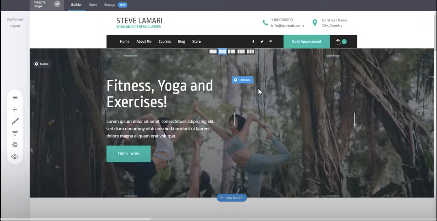
Open your website's desktop version and make all the necessary modifications or changes to the elements and design as needed.
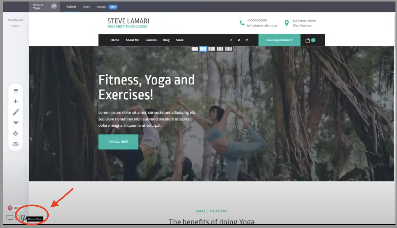
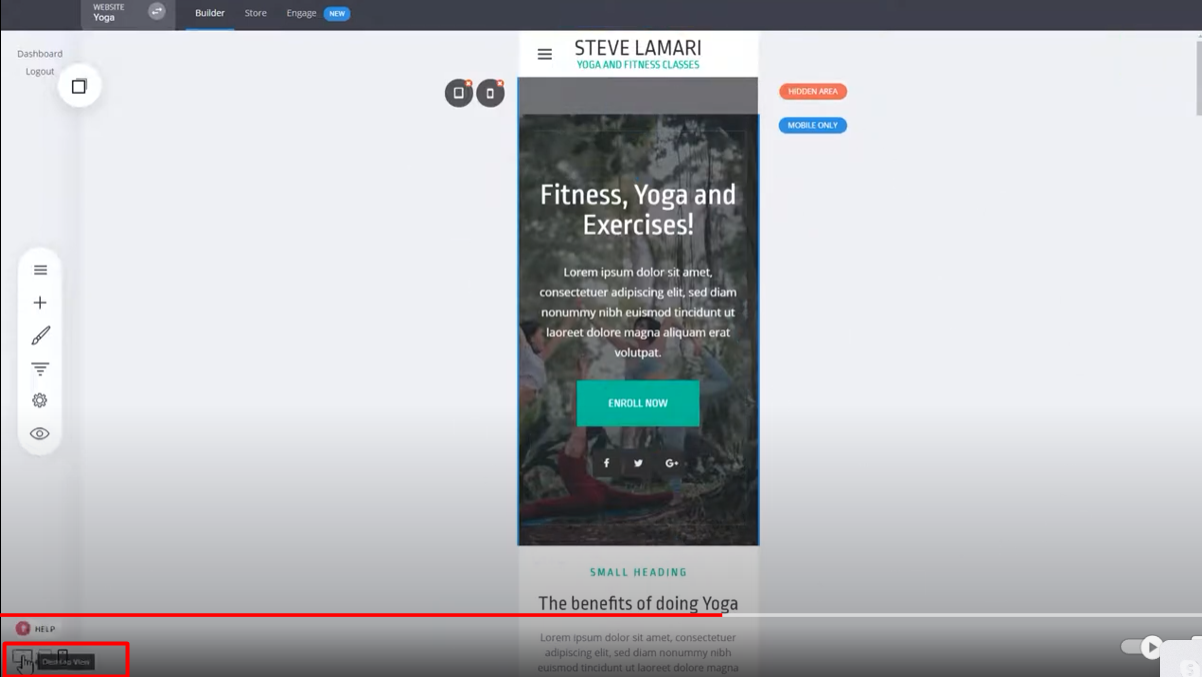
To preview how your website looks on mobile, click on the phone view or switch to mobile view mode. By default, the content should scale down and look good on mobile devices.
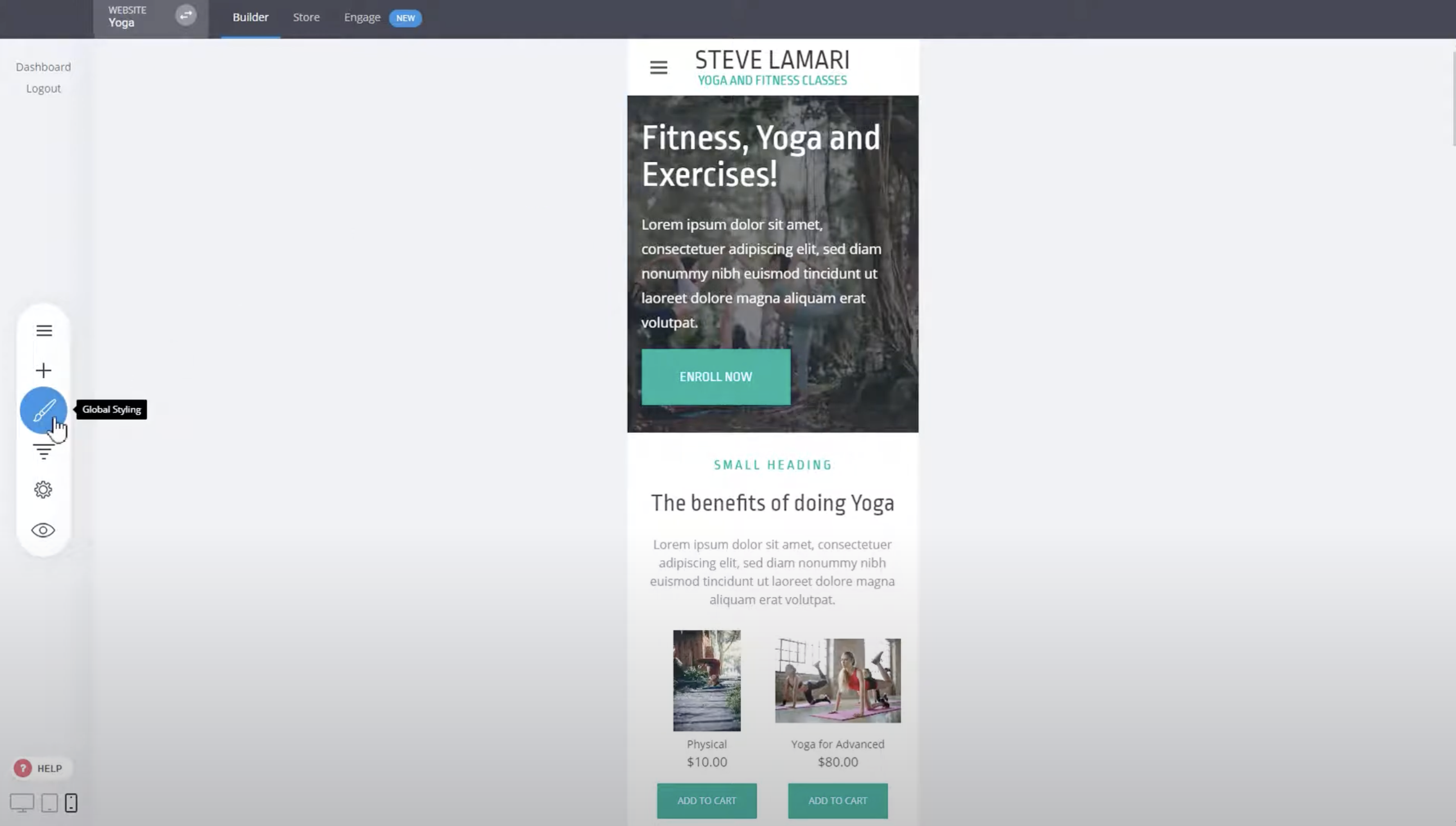
To modify the fonts specifically for mobile devices, go to the global stylings or settings. Make the desired changes to the font styles to ensure they look appropriate on smaller screens.
If you want to make further modifications, such as adding more spacing on the top or bottom of certain sections, you can add a spacer or any other widget to your design. Adjust the spacer's position to create the desired spacing.
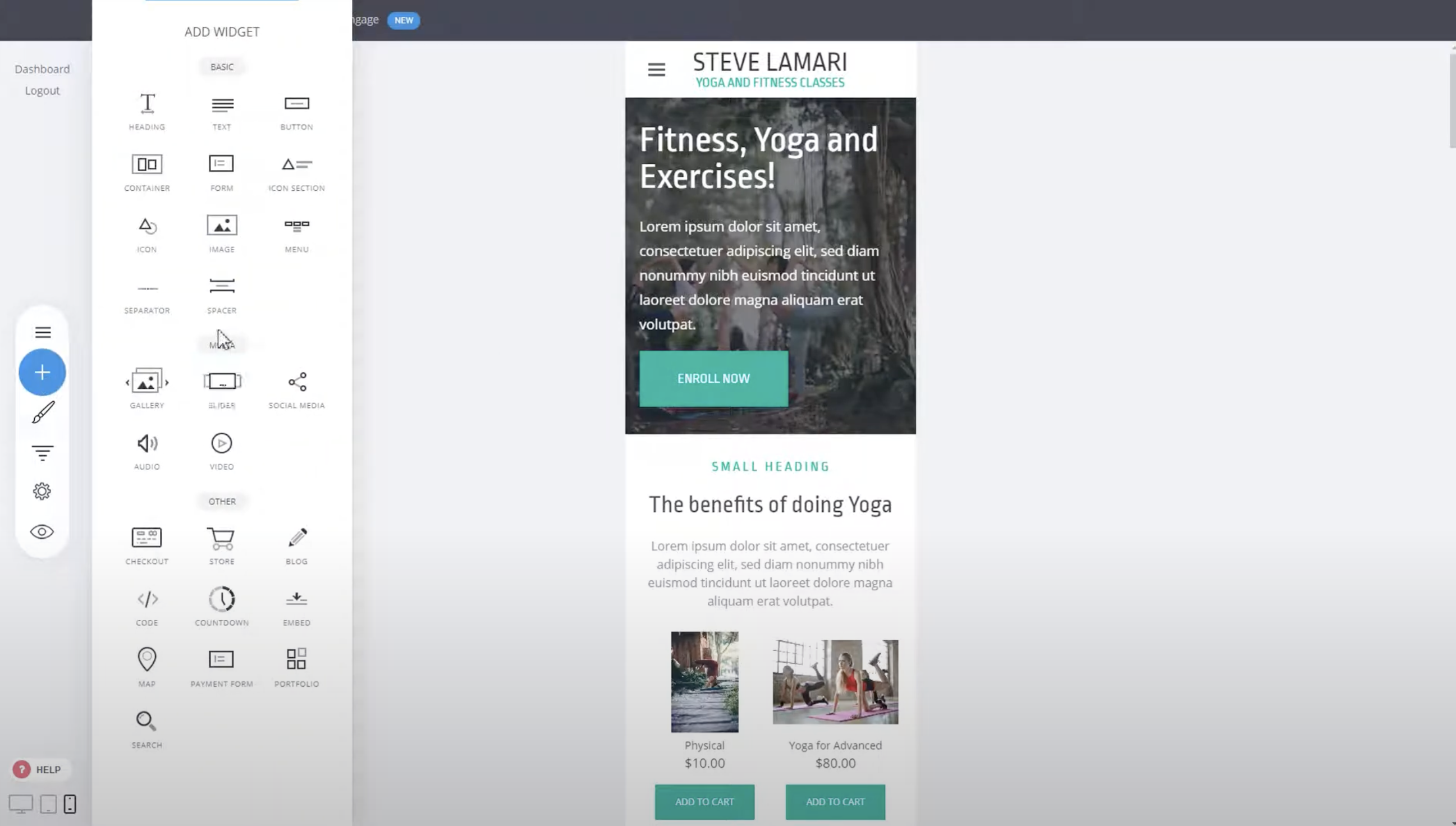
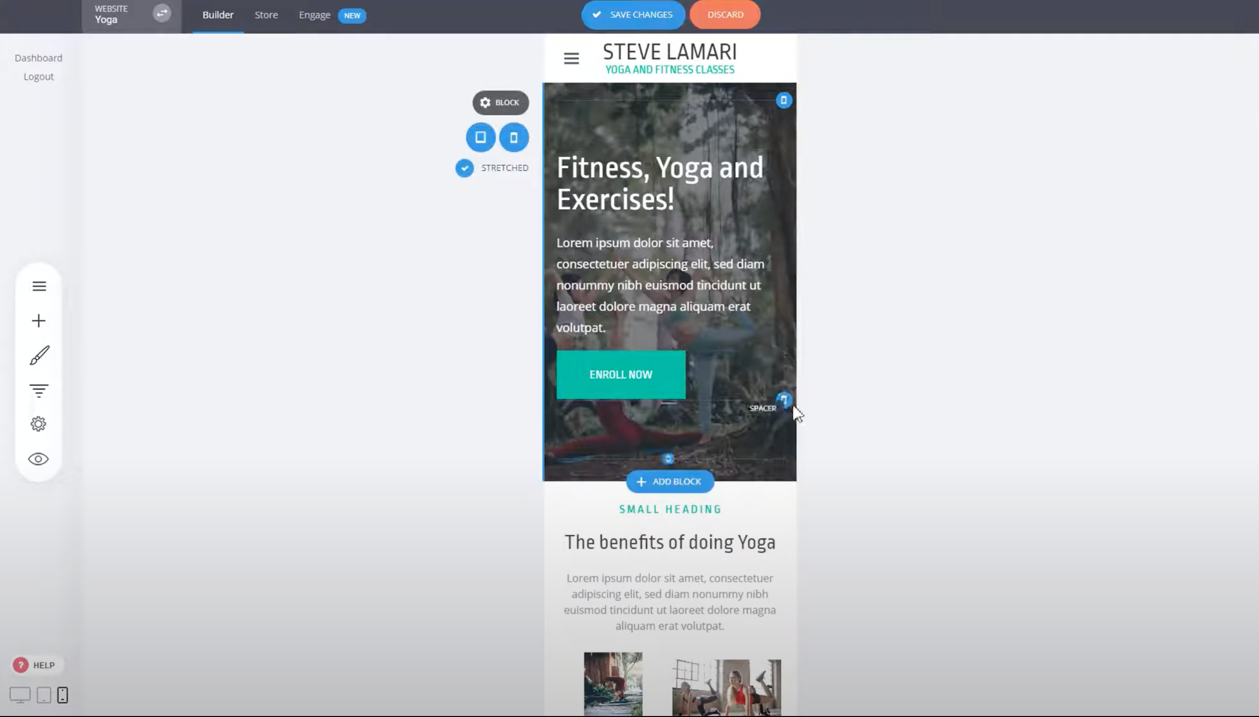
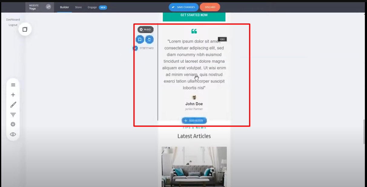
When you add a widget or block, you'll notice a blue phone icon, indicating that the widget will only be available on mobile.
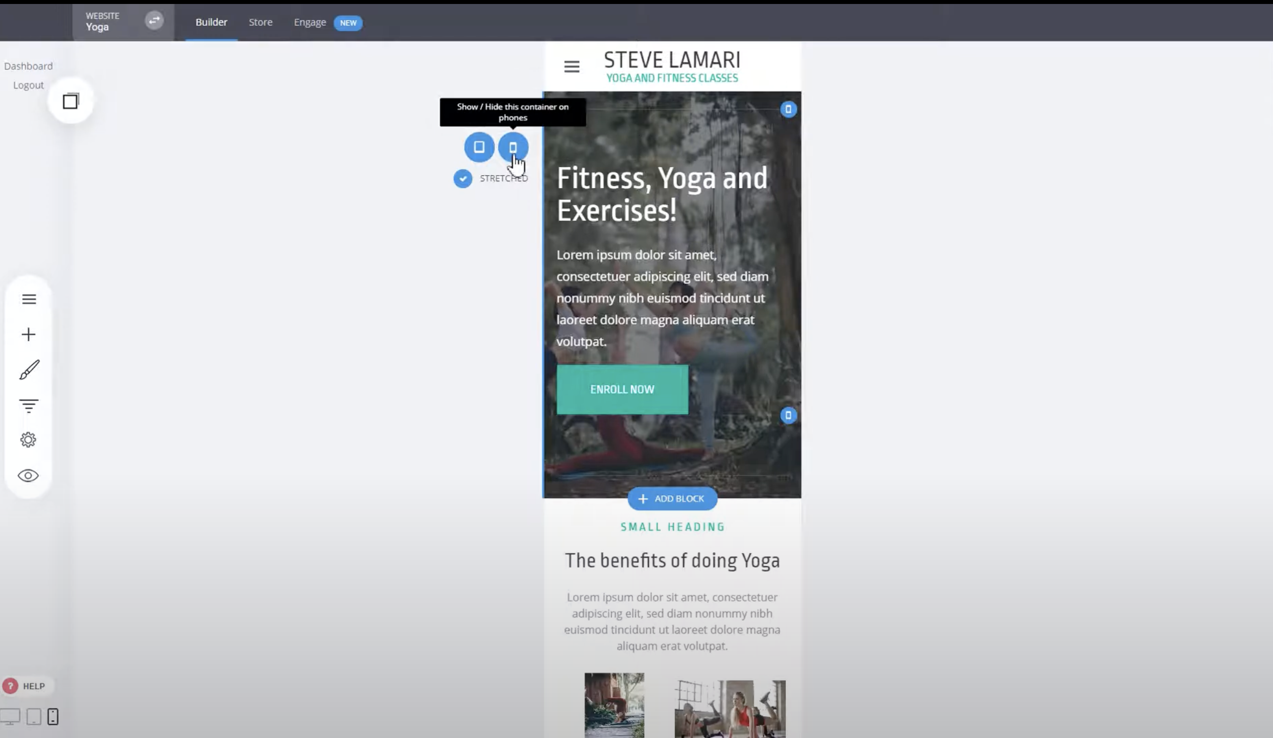
This allows you to customize elements specifically for mobile devices without affecting the desktop version. Keep in mind that any modifications you make here will also affect the desktop view. If you want to completely modify a section for mobile, you can simply copy it.
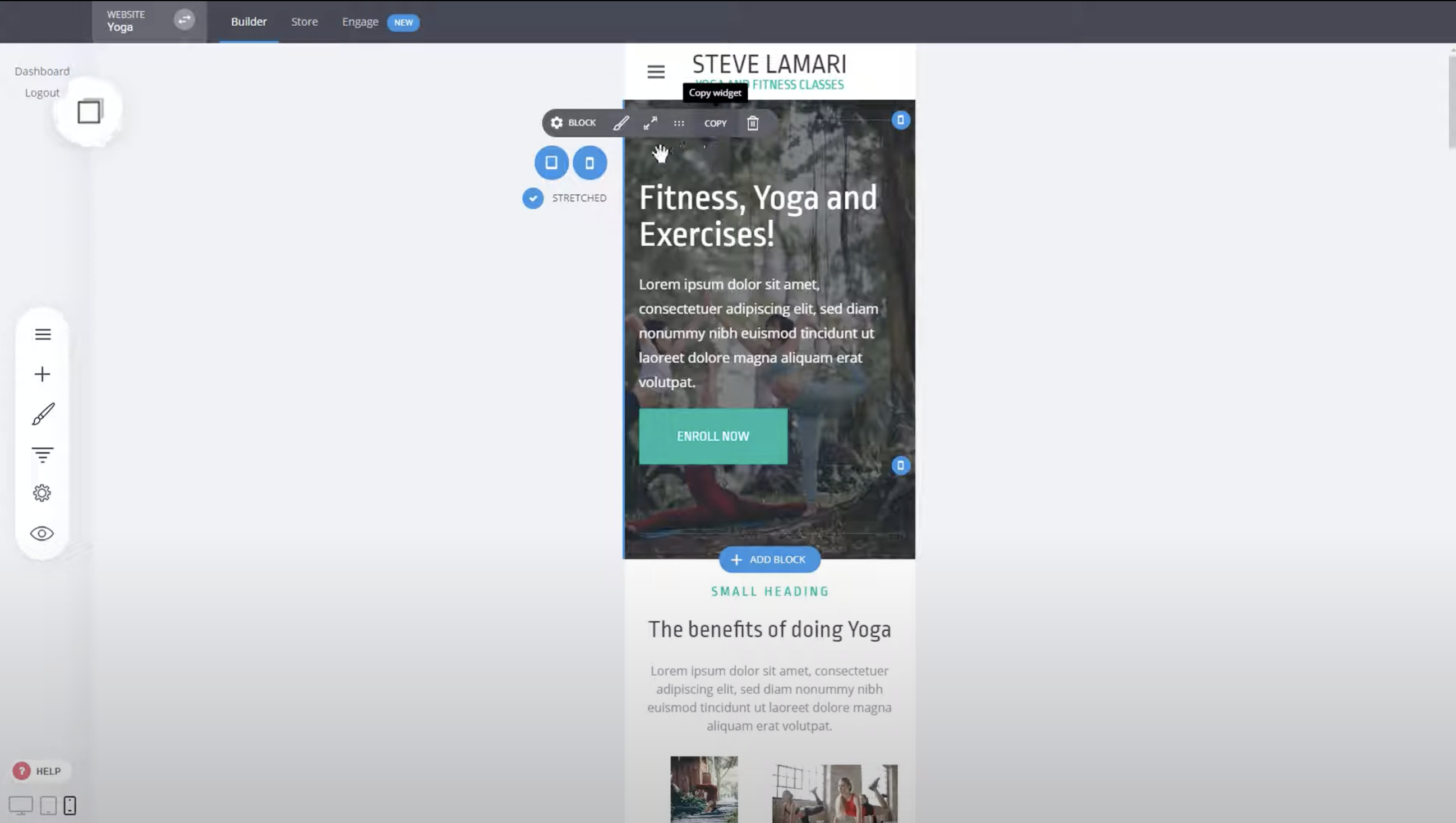
After copying the section, hide it for phone and tablet views. This will ensure that the original section is no longer visible on mobile devices, but you can still use the copied version and customize it freely.
Modify the copied section as desired. You can adjust its position, add content, or make any other changes to make it unique for mobile devices. Save the changes once you're satisfied with the modifications.
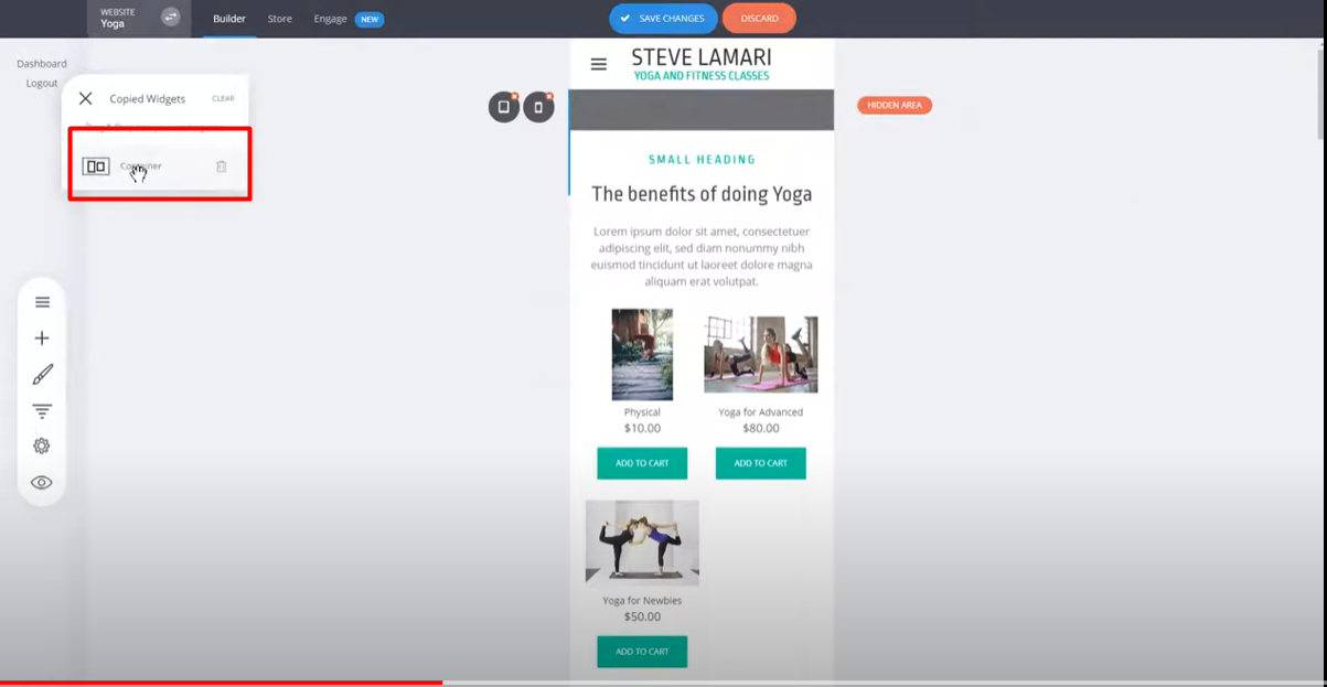
Check the desktop view to see that the changes you made to the copied section do not affect the original section. The original section will still be hidden as specified.
You can apply similar modifications and adjustments to different blocks on your website. Hide sections you don't want to appear on specific devices and show only the ones you prefer.
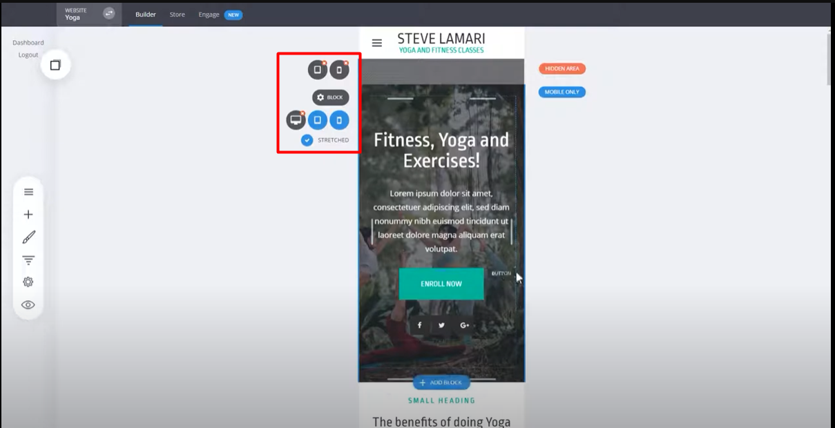
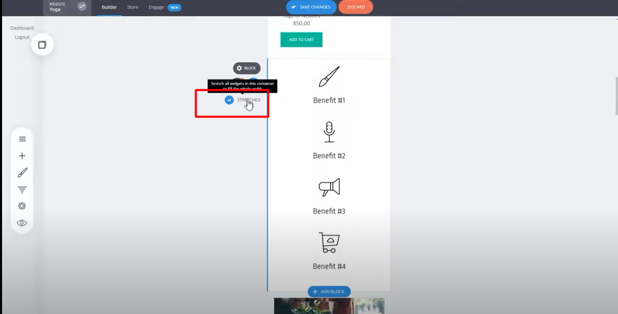
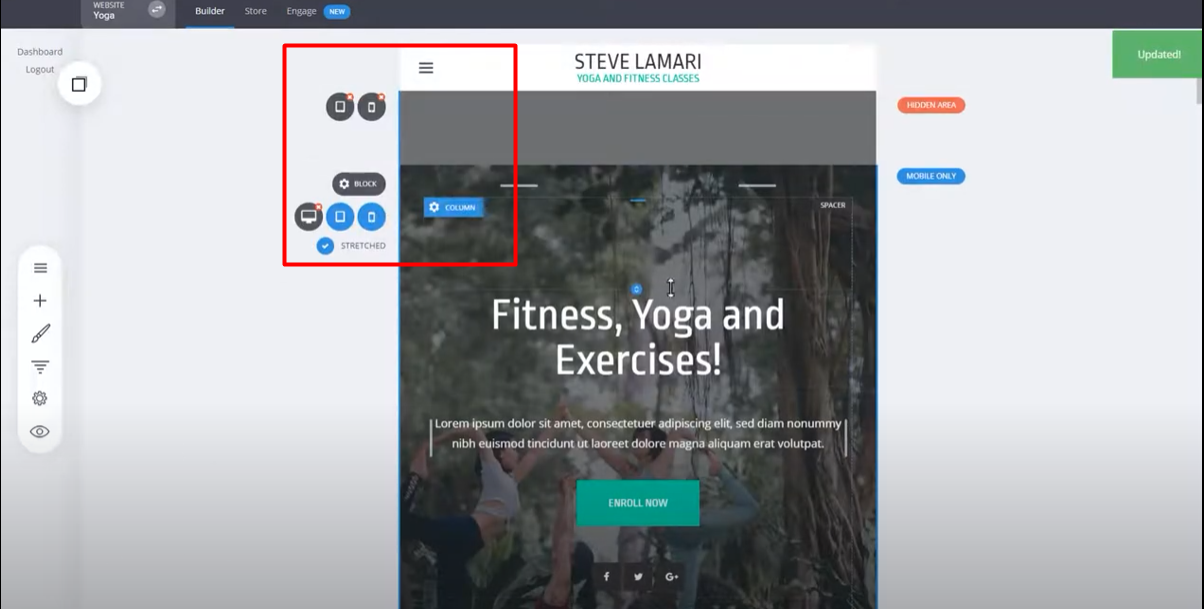
Additionally, you have the option to use the stretch option for certain sections. This allows you to keep columns as they were, which can be useful for small text or other specific design scenarios.
Make further modifications to spacings, alignments, and other elements as needed. Experiment with different options to create a design that suits the mobile experience you want to offer your users.
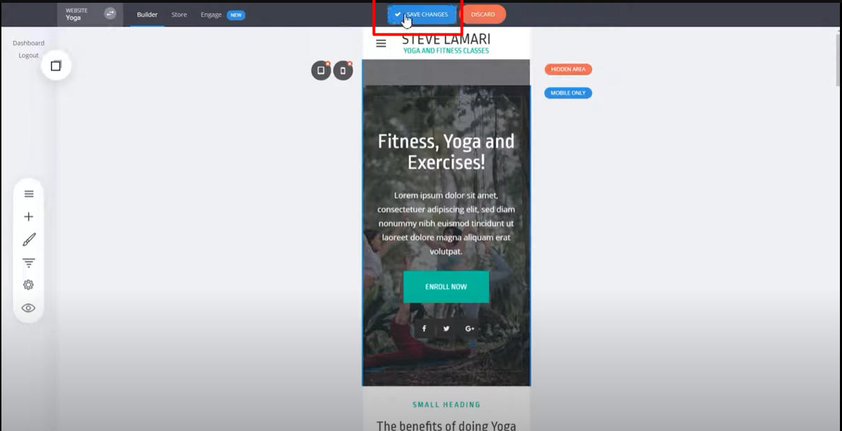
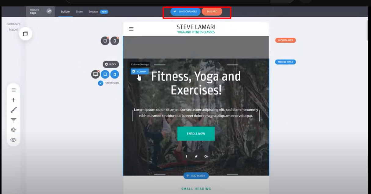
Once you're satisfied with the changes, click on "Save Changes" to apply them. Now, the modified design will be displayed on the top part of your website when viewed on mobile devices.
Verify that the desktop view remains unchanged and that the modifications only affect the mobile version of your website.
You can continue modifying different blocks, hiding unnecessary sections, and creating unique elements for mobile and tablet views as well. The process is similar to what you've done for mobile devices.
By following these steps, you can easily edit and customize your website's pages for mobile devices, creating a design that is optimized and user-friendly for users accessing your website on their smartphones or tablets.